Expandable Text in Jetpack Compose
Creating a Show More/Show Less text component in Jetpack Compose
Text truncation with “Show More/Show Less” functionality is a common UI pattern that improves readability while giving users control over their reading experience. Let’s break down how to build this component in Jetpack Compose, starting with the basics and gradually adding more sophisticated features.
Step 1: Setting Up the Basic Text Component
Let’s start with a simple text component that displays our content.
@Composable
fun ExpandableText(
    modifier: Modifier = Modifier,
    text: String,
    style: TextStyle = MaterialTheme.typography.body1,
    textColor: Color = Color.Black,
) {

    Text(
        text = text,
        modifier = modifier,
        style = style,
        color = textColor
    )
}
We will pass a long text to this components.
val sampleText =
    "Lorem Ipsum is simply dummy text of the printing and typesetting industry. Lorem Ipsum has been the industry's standard dummy text ever since the 1500s, when an unknown printer took a galley of type and scrambled it to make a type specimen book. It has survived not only five centuries, but also the leap into electronic typesetting, remaining essentially unchanged. It was popularised in the 1960s with the release of Letraset sheets containing Lorem Ipsum passages, and more recently with desktop publishing software like Aldus PageMaker including versions of Lorem Ipsum."
ExpandableText(
    text = sampleText,
    modifier = Modifier.fillMaxWidth().padding(8.dp)
)

Step 2: Adding Text Truncation
Now we will implement the core truncation functionality by adding a maximum line count and state management for expansion. We will keep the max line count to 3.
@Composable
fun ExpandableText(
    modifier: Modifier = Modifier,
    text: String,
    collapsedMaxLine: Int = 3,
    style: TextStyle = MaterialTheme.typography.body1,
    textColor: Color = Color.Black,
) {

    var isExpanded by remember { mutableStateOf(false) }

    Text(
        text = text,
        modifier = modifier,
        style = style,
        color = textColor,
        maxLines = if (isExpanded) Int.MAX_VALUE else collapsedMaxLine,
    )
}

Step 3: Adding the Show More
To show the “Show More” text, we will use the more powerful AnnotatedString instead of the regular String. We will also pass a custom style for the “Show more” text.
@Composable
fun ExpandableText(
    modifier: Modifier = Modifier,
    text: String,
    collapsedMaxLine: Int = 3,
    showMoreText: String = "Show More",
    style: TextStyle = MaterialTheme.typography.body1,
    textColor: Color = Color.Black,
    showMoreStyle: SpanStyle = SpanStyle(color = Color.Blue, fontWeight = FontWeight.W500)
) {

    var isExpanded by remember { mutableStateOf(false) }

    val annotatedText = buildAnnotatedString {
        append(text)
        if (!isExpanded) {
            withStyle(style = showMoreStyle) {
                append(showMoreText)
            }
        }
    }

    Text(
        text = annotatedText,
        modifier = modifier,
        style = style,
        color = textColor,
        maxLines = if (isExpanded) Int.MAX_VALUE else collapsedMaxLine,
    )
}

Step 4: Positioning the Show More Text Correctly
One of the trickier aspects is ensuring the “Show More” text appears at the right position. We need to calculate where to truncate the text and insert our “Show more” text.
var isExpanded by remember { mutableStateOf(false) }
var isClickable by remember { mutableStateOf(false) }
var lastCharacterIndex by remember { mutableStateOf(0) }

val annotatedText = buildAnnotatedString {
    if (isClickable) {
        val adjustedText = text.substring(startIndex = 0, endIndex = lastCharacterIndex)
            .dropLast(showMoreText.length)
            .dropLastWhile { it.isWhitespace() || it == '.' }
        append(adjustedText)
        withStyle(style = showMoreStyle) {
            append(showMoreText)
        }
    } else {
        append(text)
    }
}

Text(
    text = annotatedText,
    modifier = modifier,
    style = style,
    color = textColor,
    maxLines = if (isExpanded) Int.MAX_VALUE else collapsedMaxLine,
    onTextLayout = { textLayoutResult ->
        if (!isExpanded && textLayoutResult.hasVisualOverflow) {
            isClickable = true
            lastCharacterIndex = textLayoutResult.getLineEnd(collapsedMaxLine - 1)
        }
    },
)
We made two key changes here. One, we added onTextLayout and second, we modified the condition of annotatedText
The onTextLayout callback helps us determine if the text overflows and where to place our “Show More” text by getting the lastCharacterIndex.
We then substring the original text until the lastCharacterIndex minus the length of the “Show more” text, whitespaces and periods to place the “Show more” text at the end of the third (max) line.
This will give us the text which is three lines long with the “Show more” text.

Step 5: Adding the Expanded State with Show Less
Let’s add the logic to handle the expanded state and show the “Show Less” text.
    val annotatedText = buildAnnotatedString {
    if (isClickable) {
        if (isExpanded) {
            append(text)
            withStyle(style = showLessStyle) {
                append(showLessText)
            }
        } else {
            val adjustText = text.substring(startIndex = 0, endIndex = lastCharacterIndex)
                .dropLast(showMoreText.length)
                .dropLastWhile { it.isWhitespace() || it == '.' }
            append(adjustText)
            withStyle(style = showMoreStyle) {
                append(showMoreText)
            }
        }
    } else {
        append(text)
    }
}

Text(
    text = annotatedText,
    modifier = modifier.clickable { isExpanded = !isExpanded },
    style = style,
    color = textColor,
    maxLines = if (isExpanded) Int.MAX_VALUE else collapsedMaxLine,
    onTextLayout = { textLayoutResult ->
        if (!isExpanded && textLayoutResult.hasVisualOverflow) {
            isClickable = true
            lastCharacterIndex = textLayoutResult.getLineEnd(collapsedMaxLine - 1)
        }
    },
)
We check if the text is clickable and expanded to display the “Show Less” text. We also add a clickable modifier to our text. If we now click anywhere on the text, it will expand and collapse.
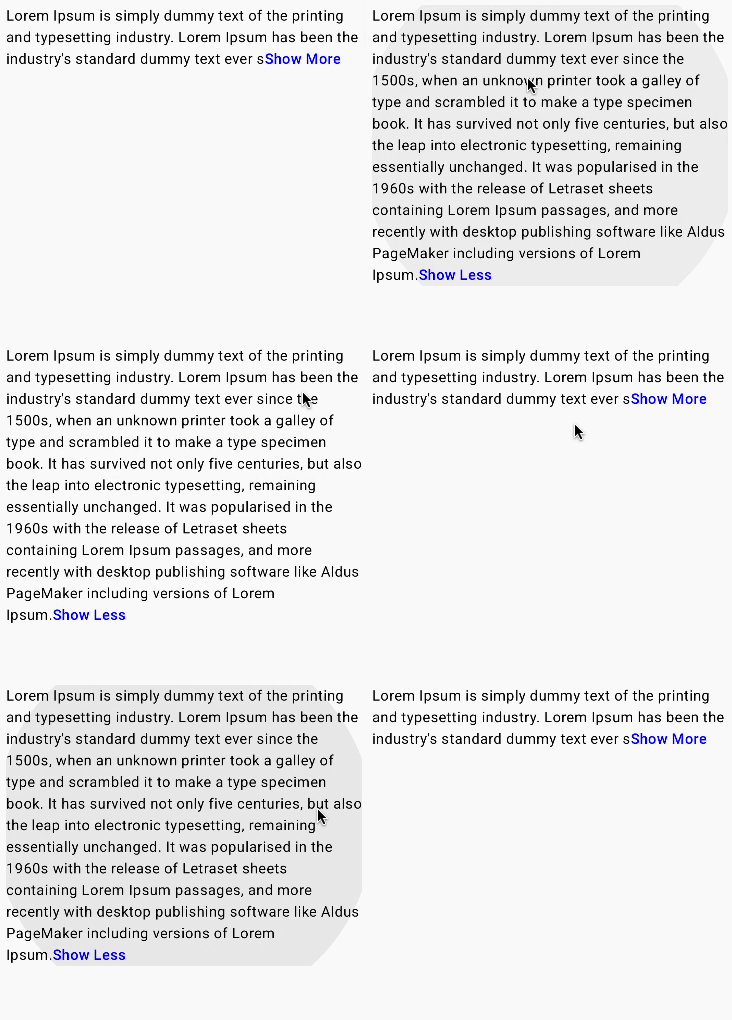
We now have our expandable text. The only problem here is that you can click anywhere on the text to expand and collapse the text. What if we need to trigger this only on clicking the “Show more/Show less” text.
Step 6: Adding Link Annotation for Show More
Now let’s make the “Show More” text clickable using LinkAnnotation.
val annotatedText = buildAnnotatedString {
    if (isClickable) {
        if (isExpanded) {
            append(text)
            withStyle(style = showLessStyle) {
                append(showLessText)
            }
        } else {
            val adjustText = text.substring(startIndex = 0, endIndex = lastCharacterIndex)
                .dropLast(showMoreText.length)
                .dropLastWhile { it.isWhitespace() || it == '.' }
            append(adjustText)
            withLink(
                link = LinkAnnotation.Clickable(
                    tag = "Show More",
                    linkInteractionListener = { isExpanded = isExpanded.not() }
                )
            ) {
                withStyle(style = showMoreStyle) {
                    append(showMoreText)
                }
            }
        }
    } else {
        append(text)
    }
}
We wrap withStyle with withLink which provides us the click functionality. We will also add the click functionality to “Show Less” as well.
val annotatedText = buildAnnotatedString {
    if (isClickable) {
        if (isExpanded) {
            append(text)
            withLink(
                link = LinkAnnotation.Clickable(
                    tag = "Show Less",
                    linkInteractionListener = { isExpanded = isExpanded.not() }
                )
            ) {
                withStyle(style = showLessStyle) {
                    append(showLessText)
                }
            }
        } else {
            val adjustText = text.substring(startIndex = 0, endIndex = lastCharacterIndex)
                .dropLast(showMoreText.length)
                .dropLastWhile { it.isWhitespace() || it == '.' }
            append(adjustText)
            withLink(
                link = LinkAnnotation.Clickable(
                    tag = "Show More",
                    linkInteractionListener = { isExpanded = isExpanded.not() }
                )
            ) {
                withStyle(style = showMoreStyle) {
                    append(showMoreText)
                }
            }
        }
    } else {
        append(text)
    }
}
The final thing to do here is to remove the clickable modifier from the Text.

There you have it. The complete implementation of Expandable Text in Jetpack Compose.
One thing to note here is that in older versions of Compose, we had ClickableText which is now deprecated. Hence, we are using LinkAnnotation.
Here is the complete code. You can find the code in this repo as well.
@Composable
fun ExpandableText(
    modifier: Modifier = Modifier,
    text: String,
    collapsedMaxLine: Int = 3,
    showMoreText: String = "Show More",
    showLessText: String = "Show Less",
    style: TextStyle = MaterialTheme.typography.body1,
    textColor: Color = Color.Black,
    showMoreStyle: SpanStyle = SpanStyle(color = Color.Blue, fontWeight = FontWeight.W500),
    showLessStyle: SpanStyle = SpanStyle(color = Color.Blue, fontWeight = FontWeight.W500),
) {

    var isExpanded by remember { mutableStateOf(false) }
    var isClickable by remember { mutableStateOf(false) }
    var lastCharacterIndex by remember { mutableStateOf(0) }

    val annotatedText = buildAnnotatedString {
        if (isClickable) {
            if (isExpanded) {
                append(text)
                withLink(
                    link = LinkAnnotation.Clickable(
                        tag = "Show Less",
                        linkInteractionListener = { isExpanded = !isExpanded }
                    )
                ) {
                    withStyle(style = showLessStyle) {
                        append(showLessText)
                    }
                }
            } else {
                val adjustText = text.substring(startIndex = 0, endIndex = lastCharacterIndex)
                    .dropLast(showMoreText.length)
                    .dropLastWhile { it.isWhitespace() || it == '.' }
                append(adjustText)
                withLink(
                    link = LinkAnnotation.Clickable(
                        tag = "Show More",
                        linkInteractionListener = { isExpanded = !isExpanded }
                    )
                ) {
                    withStyle(style = showMoreStyle) {
                        append(showMoreText)
                    }
                }
            }
        } else {
            append(text)
        }
    }

    Text(
        text = annotatedText,
        modifier = modifier,
        style = style,
        color = textColor,
        maxLines = if (isExpanded) Int.MAX_VALUE else collapsedMaxLine,
        onTextLayout = { textLayoutResult ->
            if (!isExpanded && textLayoutResult.hasVisualOverflow) {
                isClickable = true
                lastCharacterIndex = textLayoutResult.getLineEnd(collapsedMaxLine - 1)
            }
        },
    )
}