FilterChip Dropdown selector in Jetpack Compose
Creating a FilterChip dropdown selector in Jetpack Compose
Let’s build a FilterChip Dropdown Selector.
Setup Base UI
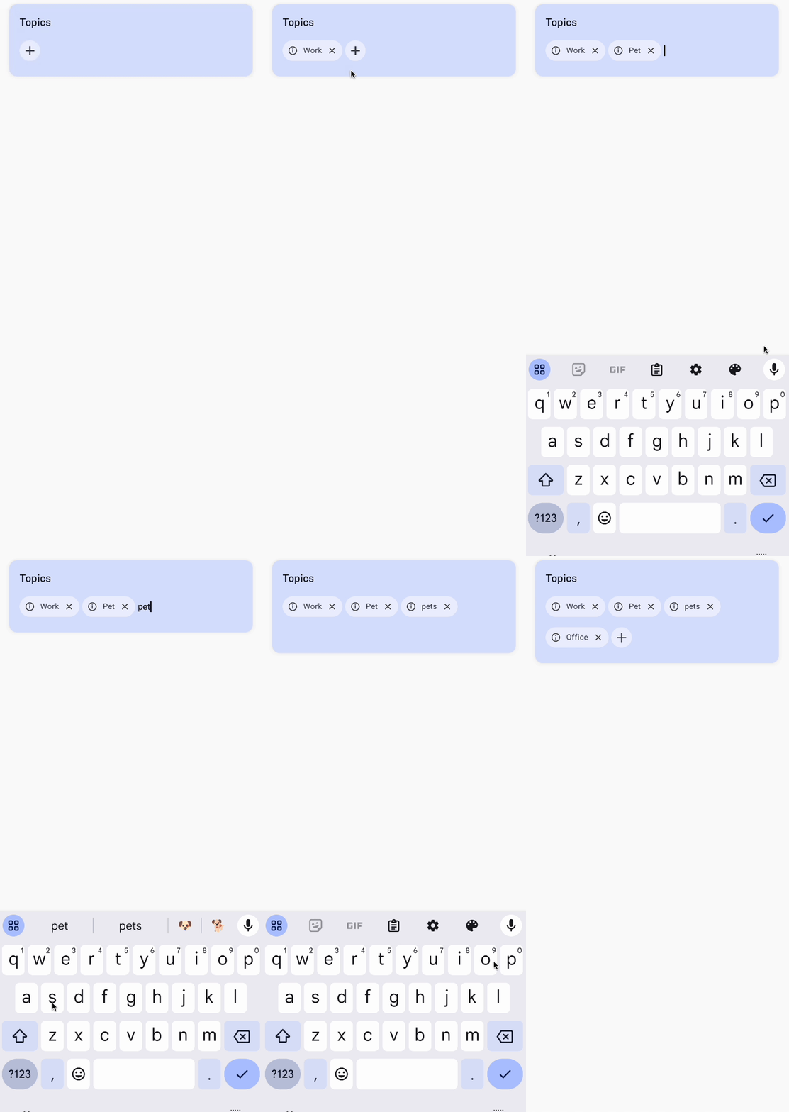
We will build a topic selector. Let’s start by adding a title.
@Composable
fun FilterChipDropdown(
    modifier: Modifier = Modifier,
) {

    TopicsList(
        modifier = modifier,
    )
}

@Composable
private fun TopicsList(
    modifier: Modifier = Modifier,
) {

    Surface(
        modifier = modifier
            .fillMaxWidth()
            .shadow(
                elevation = 8.dp,
                shape = MaterialTheme.shapes.medium,
                spotColor = Color(0xFF474F60).copy(alpha = 0.08f)
            ),
        color = Color(0xFFD9E2FF),
    ) {
        Column(
            modifier = Modifier.padding(horizontal = 16.dp),
            verticalArrangement = Arrangement.spacedBy(8.dp),
        ) {

            TitleText()
        }
    }
}

@Composable
private fun TitleText() {

    Text(
        text = "Topics",
        style = MaterialTheme.typography.titleMedium,
        color = Color(0xFF191A20),
    )
}
Add Icon
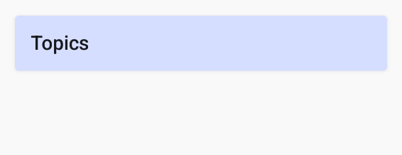
We will add the plus icon to add new topics.
@Composable
private fun ChipFlowRow(
    modifier: Modifier = Modifier,
) {

    IconButton(
        onClick = {},
        modifier = modifier
            .padding(vertical = 8.dp)
            .background(color = Color(0xFFEEF0FF), shape = CircleShape)
            .size(32.dp),
        content = {
            Icon(
                Icons.Default.Add,
                contentDescription = null,
                tint = Color(0xFF40434F),
            )
        }
    )
}
Add the above compsable to the Column just below the TitleText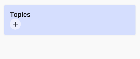
Add TextField
On click of the add icon we need to show a TextField. So we will maintain a state for it and for the entered text as well.
On click of the add icon, we hide the icon and show the TextField and on click of done in our keyboard, we hide the keyboard and show the add icon again.
We can also add a FocusRequester and KeyboardController to automatically show the keyboard on click of the add icon
@Composable
fun FilterChipDropdown(
    modifier: Modifier = Modifier,
) {
    // State
    var isAddingTopic by remember { mutableStateOf(false) }
    var searchQuery by remember { mutableStateOf("") }
    val keyboardController = LocalSoftwareKeyboardController.current
    val focusRequester = remember { FocusRequester() }

    TopicsList(
        modifier = modifier,
        isAddingTopic = isAddingTopic,
        onAddingTopicChange = { isAddingTopic = it },
        searchQuery = searchQuery,
        onSearchQueryChange = { searchQuery = it },
        keyboardController = keyboardController,
        focusRequester = focusRequester,
    )
}

@Composable
private fun ChipFlowRow(
    modifier: Modifier = Modifier,
    isAddingTopic: Boolean,
    onAddingTopicChange: (Boolean) -> Unit,
    searchQuery: String,
    onSearchQueryChange: (String) -> Unit,
    keyboardController: SoftwareKeyboardController?,
    focusRequester: FocusRequester,
) {

    LaunchedEffect(isAddingTopic) {
        // Don't show keyboard when not adding a topic
        if (isAddingTopic.not()) return@LaunchedEffect
        focusRequester.requestFocus()
        keyboardController?.show()
    }

    // Show Icon when not typing
    if (isAddingTopic.not()) {
        IconButton(
            onClick = { onAddingTopicChange(true) },
            modifier = modifier
                .padding(vertical = 8.dp)
                .background(color = Color(0xFFEEF0FF), shape = CircleShape)
                .size(32.dp),
            content = {
                Icon(
                    Icons.Default.Add,
                    contentDescription = null,
                    tint = Color(0xFF40434F),
                )
            }
        )
    } else { // Show Keyboard when typing
        BasicTextField(
            value = searchQuery,
            onValueChange = { onSearchQueryChange(it) },
            modifier = Modifier
                .wrapContentWidth()
                .padding(top = 16.dp)
                .focusRequester(focusRequester),
            singleLine = true,
            keyboardOptions = KeyboardOptions(
                keyboardType = KeyboardType.Text,
                imeAction = ImeAction.Done,
            ),
            keyboardActions = KeyboardActions(
                onDone = {
                    onAddingTopicChange(false)
                    keyboardController?.hide()
                }
            )
        )
    }
}
Creating the FilterChip
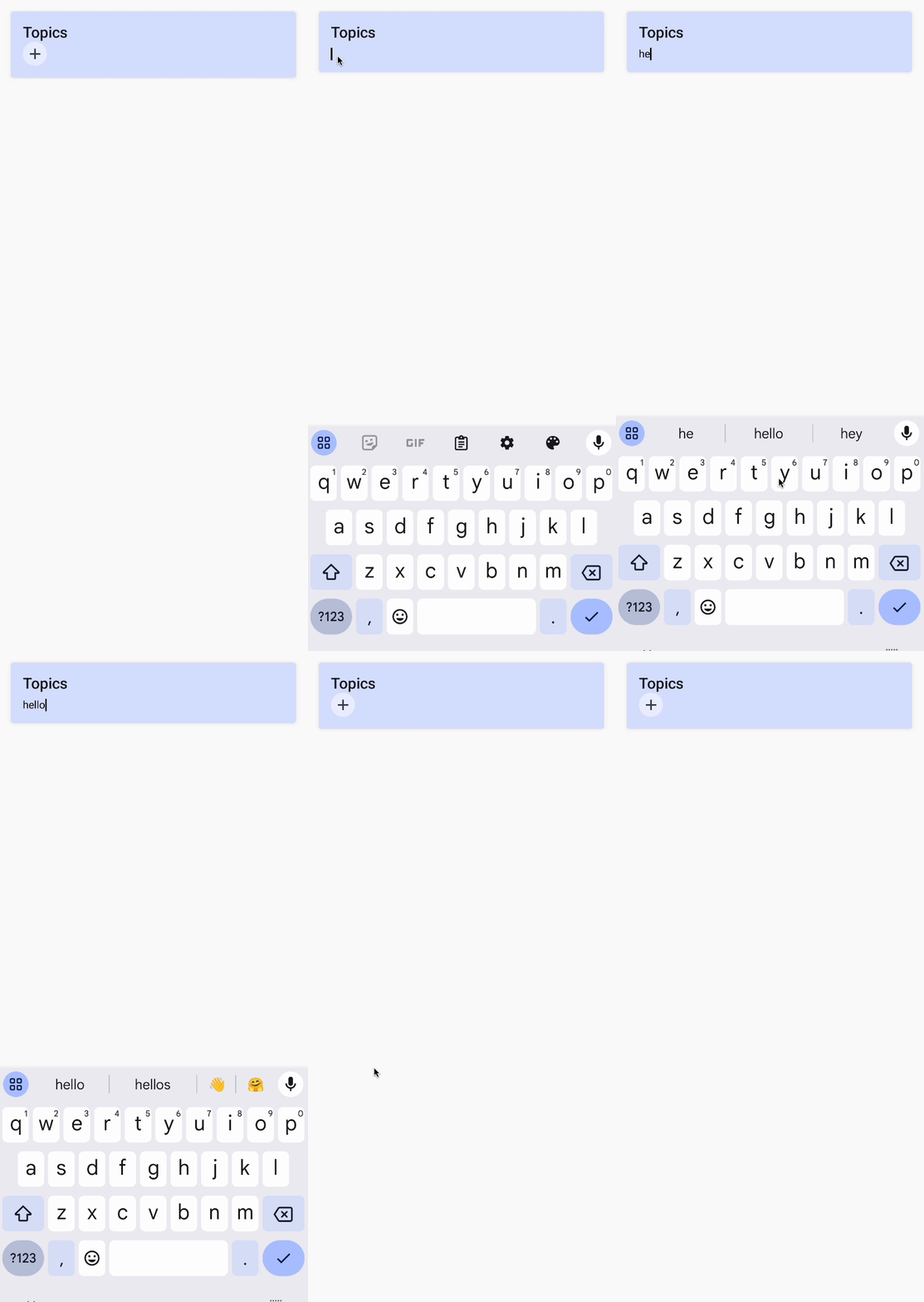
Lets design the FilterChip. It will have a leading icon, trailing icon and label. Clicking on the trailing icon will delete the chip from the saved items list.
@Composable
fun TopicChip(
    modifier: Modifier = Modifier,
    topic: String,
    onCancel: () -> Unit = {},
) {

    FilterChip(
        modifier = modifier,
        selected = true,
        onClick = {},
        shape = MaterialTheme.shapes.large,
        colors = FilterChipDefaults.filterChipColors().copy(selectedContainerColor = Color(0xFFEEF0FF)),
        leadingIcon = {
            Icon(
                Icons.Outlined.Info,
                modifier = Modifier.size(16.dp),
                contentDescription = null,
                tint = Color.DarkGray,
            )
        },
        trailingIcon = {
            Icon(
                imageVector = Icons.Outlined.Close,
                modifier = Modifier.size(16.dp).clickable { onCancel() },
                contentDescription = "Cancel",
                tint = Color.DarkGray,
            )
        },
        label = {
            Text(
                text = topic,
                style = MaterialTheme.typography.bodySmall,
                color = Color(0xFF40434F),
                textAlign = TextAlign.Center,
                maxLines = 1,
                overflow = TextOverflow.Ellipsis,
            )
        }
    )
}

Adding the FilterChip
After we have typed or selected an item from the dropdown, we need to show that item in the form of a Chip.
We will use a FlowRow to display all the chips.
We will store all the chips in a selectedTopics state.
// Add this to the FilterChipDropdown (root) composable
var selectedTopics by remember { mutableStateOf(setOf<String>()) }

@Composable
private fun ChipFlowRow(
    modifier: Modifier = Modifier,
    selectedTopics: Set<String>,
    onSelectedTopics: (Set<String>) -> Unit,
    // ...
) {
    // Selected Topics
    FlowRow(
        modifier = modifier.fillMaxWidth(),
        verticalArrangement = Arrangement.Center,
    ) {

        selectedTopics.forEach { topic ->
            TopicChip(
                modifier = Modifier.padding(end = 4.dp),
                topic = topic,
                onCancel = { onSelectedTopics(selectedTopics - topic) }
            )
        }

        // Icon and TextField ...
    }
}
Once we click on done in the keyboard, we need to save the chip to the selectedTopics state and clear our search query. So let’s update the KeyboardActions of our TextField to handle it.
keyboardActions = KeyboardActions(
    onDone = {
        onSelectedTopics(selectedTopics + searchQuery)
        onAddingTopicChange(false)
        onSearchQueryChange("")
        keyboardController?.hide()
    }
)
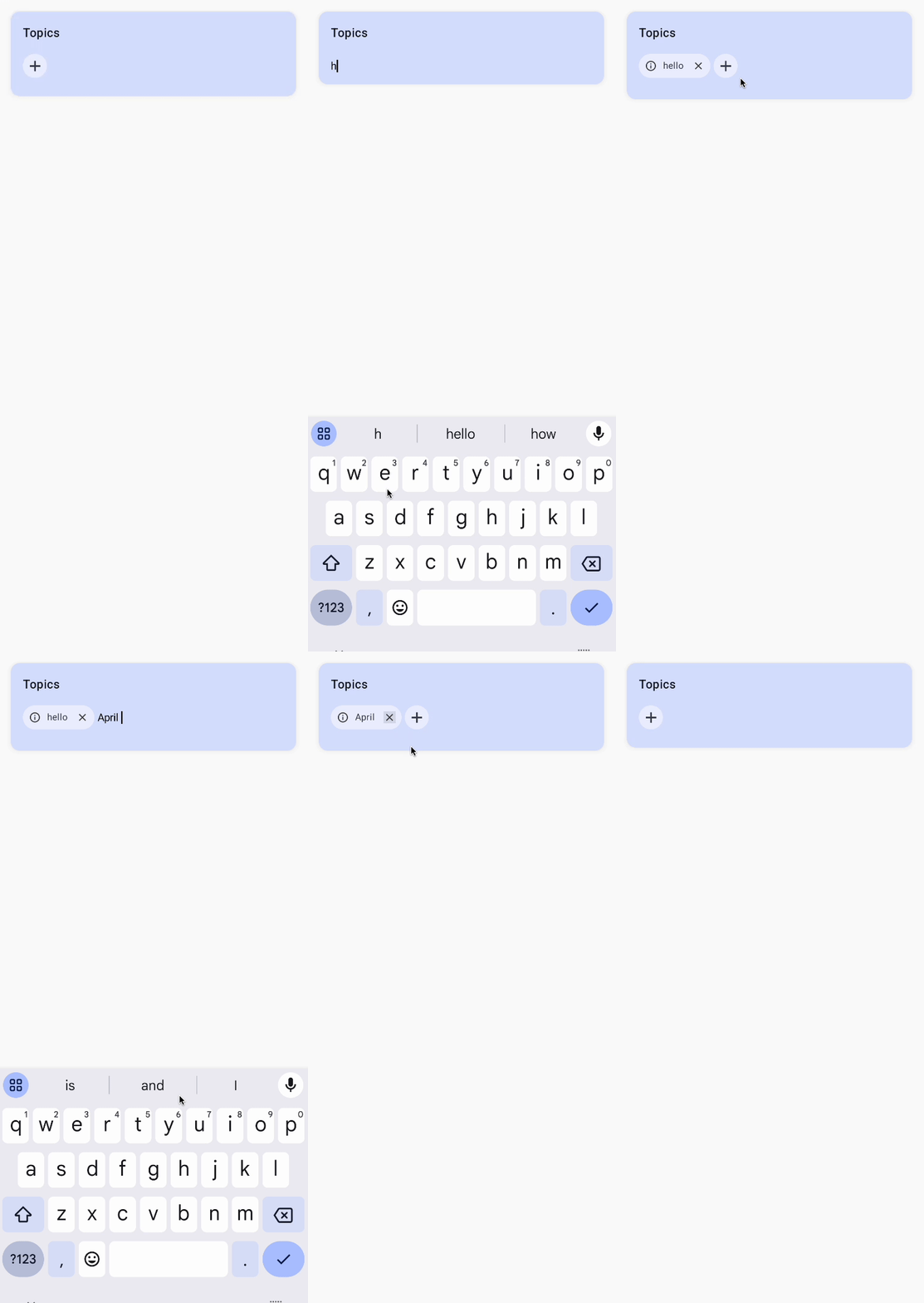
We now have our basic textfield to chip selector. Now we will add a dropdown that shows us the saved list of topics and an option to create new topics.
Creating the Dropdown menu
First, let us create a state for the topics that we will be saving. We also populate them for ease of testing.
var savedTopics by remember { mutableStateOf(setOf("Work", "Hobby", "Personal", "Office", "Workout")) }
Now, we will create the dropdown menu which will show the list of all saved topics.
@Composable
fun TopicDropdown(
    modifier: Modifier = Modifier,
    selectedTopics: Set<String>,
    onSelectedTopicsChange: (Set<String>) -> Unit,
    onAddingTopicChange: (Boolean) -> Unit,
    searchQuery: String,
    onSearchQueryChange: (String) -> Unit,
    savedTopics: Set<String>,
    onSavedTopicsChange: (Set<String>) -> Unit = {},
) {

    Box(
        modifier = modifier
            .fillMaxWidth()
            .padding(horizontal = 16.dp)
            .shadow(elevation = 8.dp, shape = MaterialTheme.shapes.medium),
    ) {

        Column(
            modifier = modifier
                .fillMaxWidth()
                .background(color = Color.White)
        ) {

            // Filter saved topics based on search query
            val matchingSavedTopics = savedTopics.filter {
                it.startsWith(prefix = searchQuery, ignoreCase = true) && !selectedTopics.contains(it)
            }

            // Show matching saved topics first
            matchingSavedTopics.forEach { topic ->
                Row(
                    modifier = Modifier
                        .fillMaxWidth()
                        .clickable(
                            onClick = {
                                onSelectedTopicsChange(selectedTopics + topic)
                                onSearchQueryChange("")
                                onAddingTopicChange(false)
                            }
                        )
                        .padding(horizontal = 16.dp, vertical = 8.dp),
                    verticalAlignment = Alignment.CenterVertically,
                ) {

                    Text(
                        text = topic,
                        style = MaterialTheme.typography.titleSmall,
                        color = Color(0xFF40434F),
                    )
                }
            }
        }
    }
}
We first filter the savedTopics with our searchQuery to find the matching words. We then show the filtered items in a Column.
On clicking of an item in the dropdown, we add them to the selectedTopics set.
We can now call the TopicDropdown in our root composable.
@Composable
fun FilterChipDropdown(
    modifier: Modifier = Modifier,
) {

    var selectedTopics by remember { mutableStateOf(setOf<String>()) }
    var savedTopics by remember { mutableStateOf(setOf("Work", "Hobby", "Personal", "Office", "Workout")) }
    var isAddingTopic by remember { mutableStateOf(false) }
    var searchQuery by remember { mutableStateOf("") }
    val keyboardController = LocalSoftwareKeyboardController.current
    val focusRequester = remember { FocusRequester() }

    Column(
        modifier = modifier.fillMaxSize()
    ) {

        TopicsList(
            modifier = modifier,
            selectedTopics = selectedTopics,
            onSelectedTopics = { selectedTopics = it },
            isAddingTopic = isAddingTopic,
            onAddingTopicChange = { isAddingTopic = it },
            searchQuery = searchQuery,
            onSearchQueryChange = { searchQuery = it },
            keyboardController = keyboardController,
            focusRequester = focusRequester,
        )

        if (searchQuery.isEmpty()) return

        TopicDropdown(
            modifier = modifier,
            selectedTopics = selectedTopics,
            onSelectedTopicsChange = { selectedTopics = it },
            onAddingTopicChange = { isAddingTopic = it },
            searchQuery = searchQuery,
            onSearchQueryChange = { searchQuery = it },
            savedTopics = savedTopics,
            onSavedTopicsChange = { savedTopics = it },
        )
    }
}
We only call the TopicDropdown if the searchQuery is not empty, that is only when the user is typing.

Create Item in Dropdown
Right now, on click of the done button on our keyboard, we add an item to our selectedTopics set. We can also add a Create item in our dropdown, which will allow us to create a topic as well.
Add the following code at the end of the TopicDropdown composable.
// Show create option if query doesn't exist in saved topics
if (!savedTopics.any { it.equals(searchQuery, ignoreCase = true) }) {
    Row(
        modifier = Modifier
            .fillMaxWidth()
            .clickable {
                val newTopic = searchQuery.trim()
                onSavedTopicsChange(savedTopics + newTopic)
                onSelectedTopicsChange(selectedTopics + newTopic)
                onSearchQueryChange("")
                onAddingTopicChange(false)
            }
            .padding(horizontal = 16.dp, vertical = 8.dp),
        horizontalArrangement = Arrangement.spacedBy(8.dp),
        verticalAlignment = Alignment.CenterVertically,
    ) {
        Icon(
            imageVector = Icons.Default.Add,
            modifier = Modifier.size(12.dp),
            contentDescription = null,
            tint = MaterialTheme.colorScheme.primary,
        )

        Text(
            text = "Create $searchQuery",
            style = MaterialTheme.typography.titleSmall,
            color = Color.Black,
        )
    }
}
This will check if the searchQuery exists in the savedTopics. If it does not exist, it will show the Create button.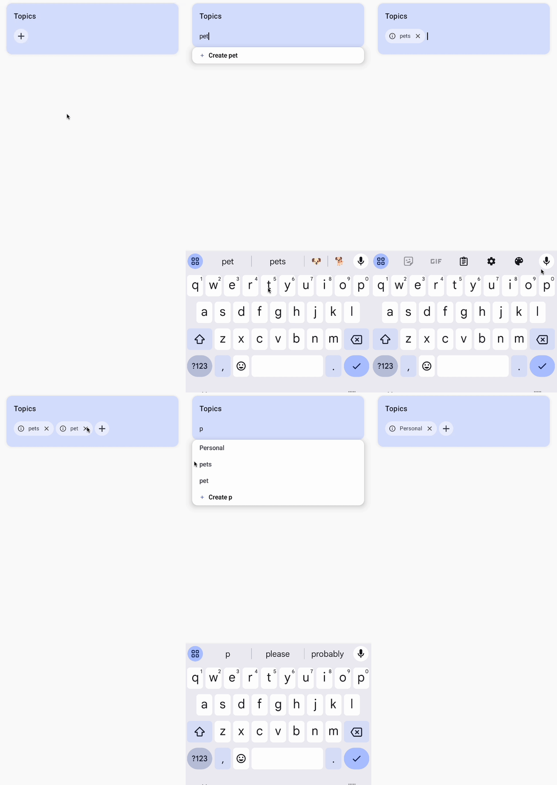
Finishing touches
We can align the dropdown slightly above the TopicsList composable for a better look. Also, we can reduce the horizontal padding of the dropdown.
@Composable
fun TopicDropdown(
    modifier: Modifier = Modifier,
    // ...
) {

    Box(
        modifier = modifier
            .fillMaxWidth()
            .padding(horizontal = 24.dp)
            .offset(y = -(8.dp))
            .shadow(elevation = 8.dp, shape = MaterialTheme.shapes.medium),
    ) {
        // ...
    }
}
We can also update the KeyboardActions to remove adding of topics on clicking of done if we only want to add via the create button.

There you have it. A FilterChip dropdown selector in Jetpack Compose.
You can find the complete code here.